Housing of your choice
Create a home as you like, unrestricted by floor plans or interior design
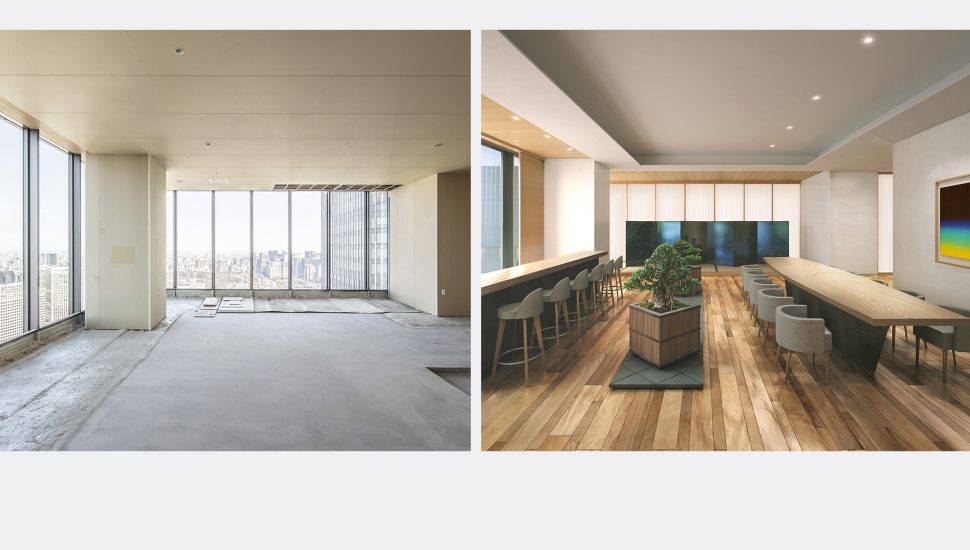
On the upper floors of Toranomon Hills Residential Tower, which was completed in January 2022, are skeleton units where residents can design interiors and floor plans any way they want—an unconventional approach among newly built condominiums in Japan. Read on to learn more about this innovative take on residential living.
TEXT BY MARI MATSUBARA
Translation by Hills Life Daily
Toranomon Hills Residential Tower is notable for the designs of its private and common areas, both by New York based interior design house tonychi studio. But the unique features go beyond that: several units on the 43rd through 54th floors remain undecorated or unfinished. These special properties let the residents create floor plans and decorate the interiors however they want after purchase, free to alter anything except for the beams and columns that form the structure.
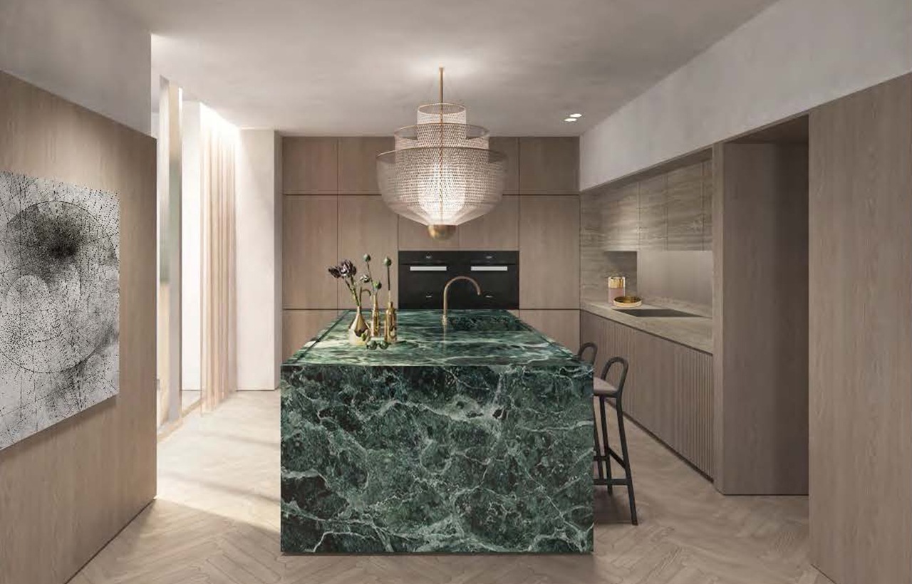
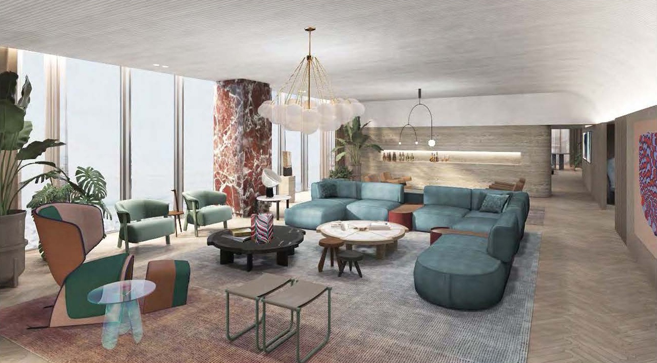
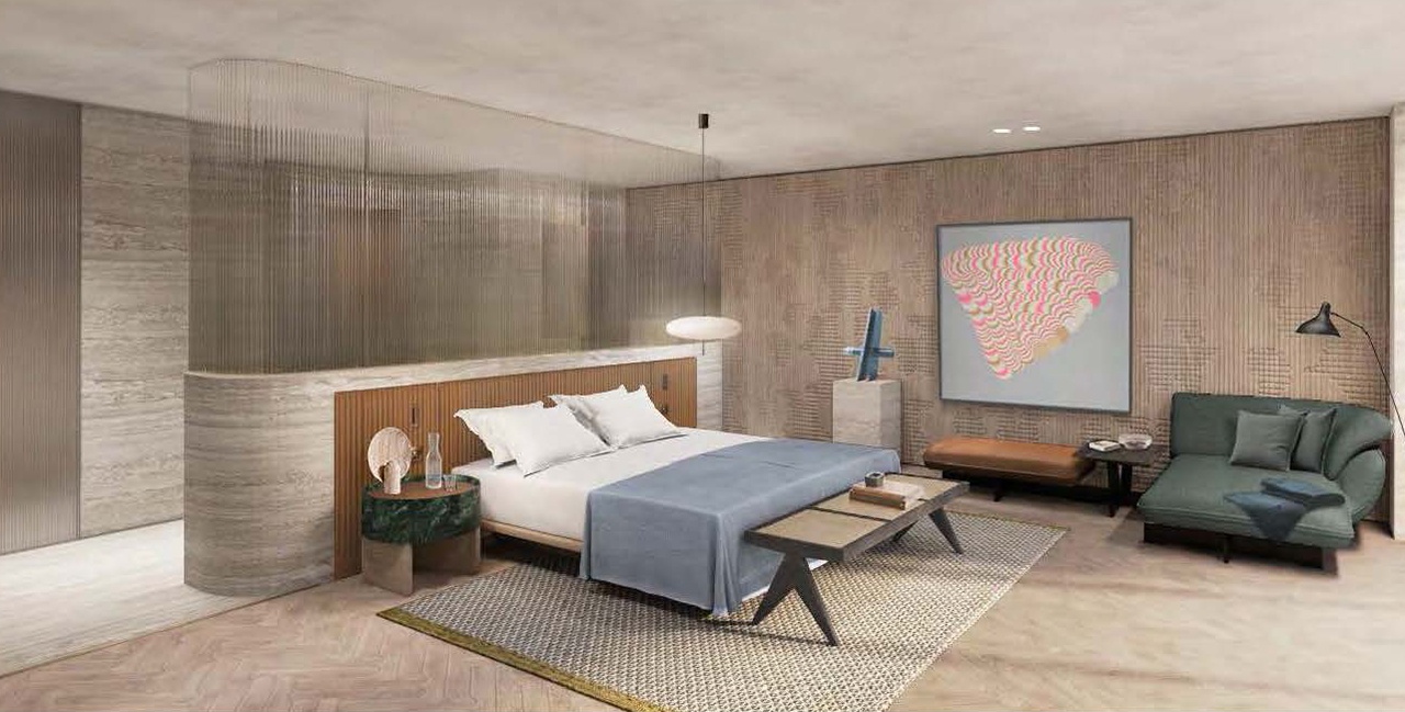
The resident has free rein over the planning stage, but it can be difficult to visualize a property from a completely blank slate. Mori Building thus decided to approach architects and interior designers in Japan and abroad to propose model plans that would help inspire residents. The lineup includes New Material Research Laboratory (SHINSOKEN), Patricia Urquiola, Lissoni & Partners and Nicola Gallizia, with each bringing their own unique flavor to the table and offering lifestyles with completely different tastes.
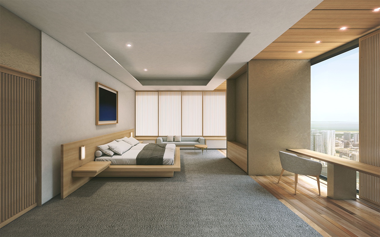
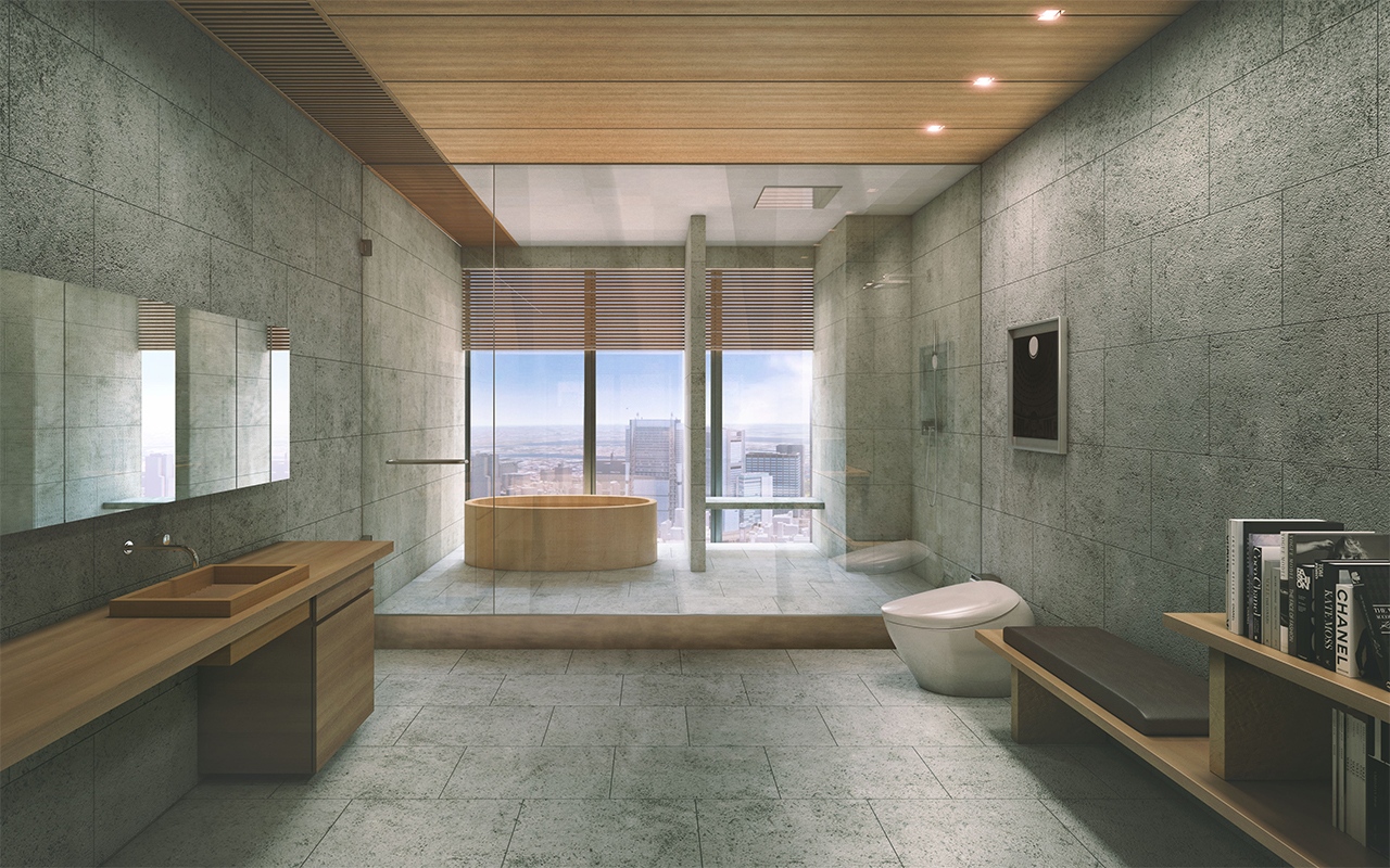
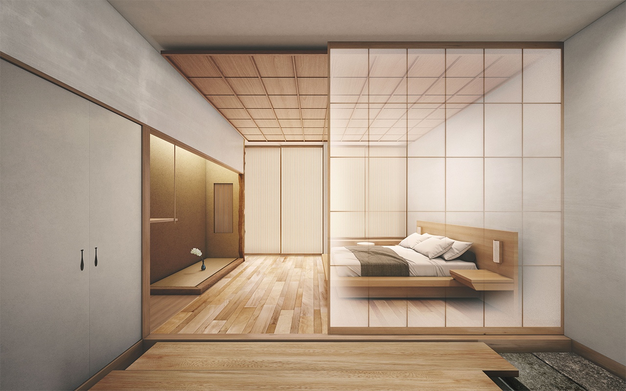
❶ Plan by New Material Research Laboratory (SHINSOKEN)[approx. 500 sq. m.]
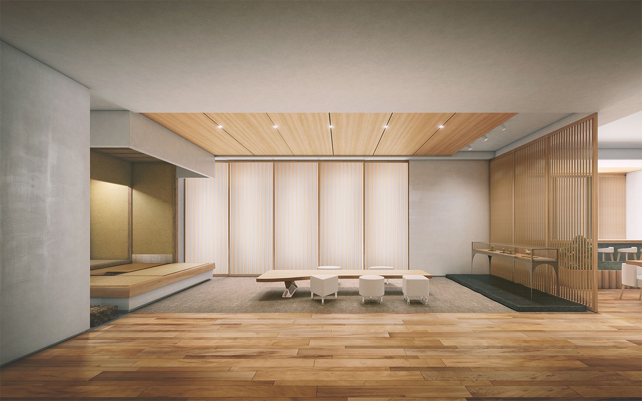
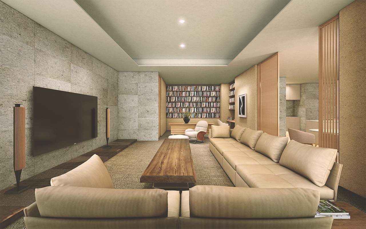
New Material Research Laboratory (SHINSOKEN) is an architectural design firm led by contemporary artist Hiroshi Sugimoto and architect Tomoyuki Sakakida. With “old materials are new” as their motto, they embrace a unique approach in the modern architectural industry. In addition to notable public projects such as Enoura Observatory and the renovation of MOA Museum of Art, New Material Research Laboratory (SHINSOKEN) also has experience in the complete renovation of private residences. The interior design features solid wood and stone, rather than manufactured materials, and incorporates traditional Japanese construction methods.

Floor plan by SHINSOKEN ©New Material Research Laboratory
SHINSOKEN’s Tomoyuki Sakakida describes the model plan as “a standardization and amalgamation of the architecture we have worked on in the past.”

TOMOYUKI SAKAKIDA
Born in Shiga in 1976. After working at Nihon Sekkei Inc., Sakakida established his own practice, Tomoyuki Sakakida Architect and Associates, in 2003. In parallel with running the practice, he also worked for Waro Kishi + K. Associates/EX for three years. In 2008, Sakakida founded New Material Research Laboratory (SHINSOKEN) with artist Hiroshi Sugimoto. He now serves as Representative Director of SHINSOKEN.
“We have worked on several private residential projects that involved renovating old buildings, mostly around 30 to 40 years old, completely from the skeleton. This project, however, is a brand-new tower condominium—but we used our SHINSOKEN expertise the same way we do when we work on a renovation project. The concept for our proposal centers on using solid materials from Japan. We choose coniferous trees for the wood, tuff for the stone, and shikkui plaster for the walls. In the conventional construction industry, these are not necessarily preferred materials. But we use them because solid, thick materials are essential to creating a space that not only looks great but also has a pleasing sense of touch and smell. It all comes out of our commitment to proposing designs that let people enjoy the charm of a space as time passes.”

“For example, a solid wood floor can be dented if something hard drops onto it, but it also has the ability to return to its original shape when steam is applied. Plaster and tuff-type stone are both porous natural materials with excellent humidity control. As soon as you start living in the space, the sense of comfort running through everything will begin to emerge in full. The beautiful wood grain and stone surfaces, meanwhile, will create a sense of time passing by. When I get to work on a design for a high-rise residences, I envision taking the richness of Japanese residences, historically made of natural materials and co-existing with nature, and bringing that dimension into a new, urban setting.”

——What type of residents did you have in mind as you put together the plan?
“We envisioned a couple that travels frequently between several countries, owns a few houses, and wants to have a base in Tokyo mainly to serve as a guest house. The couple might stay alone there at times; their children might join them; or guests will stay together and have a house party. Our floor plan flexibly accommodates that diverse mix of scenarios and occasions. The kitchen divides the family dining and the guest dining while accommodating both. The entire space can be used as one connected room by opening the sliding doors. The design also provides separate bathrooms for the couple, reflecting the recent standards of Western lifestyles.”

“To date, the whole structure of the construction industry in Japan seems to have positioned condominiums for sale as financial products— the banks approve loans, giving preferential treatment to the “product” of a new building, and the developer responds by creating a “product” with high cost performance, including infill elements (partitions, interior components, and facilities) . That makes it hard to “create a quality space,” which is what architects always set out to do. However, residents who have more experience, like those who have already built several houses, don’t see those products as appealing; to them, those types of spaces a just commodities. I think that Mori Building’s approach of providing skeleton units and letting residents create a new style of living space to fit their personal preferences is in line with this trend.”
PORTRAIT BY HIROAKI SUGITA
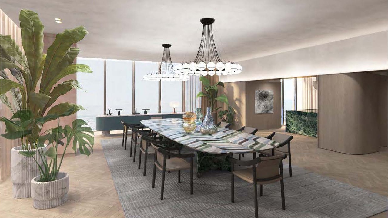
❷ Plan by Patricia Urquiola [approx. 500sqm]
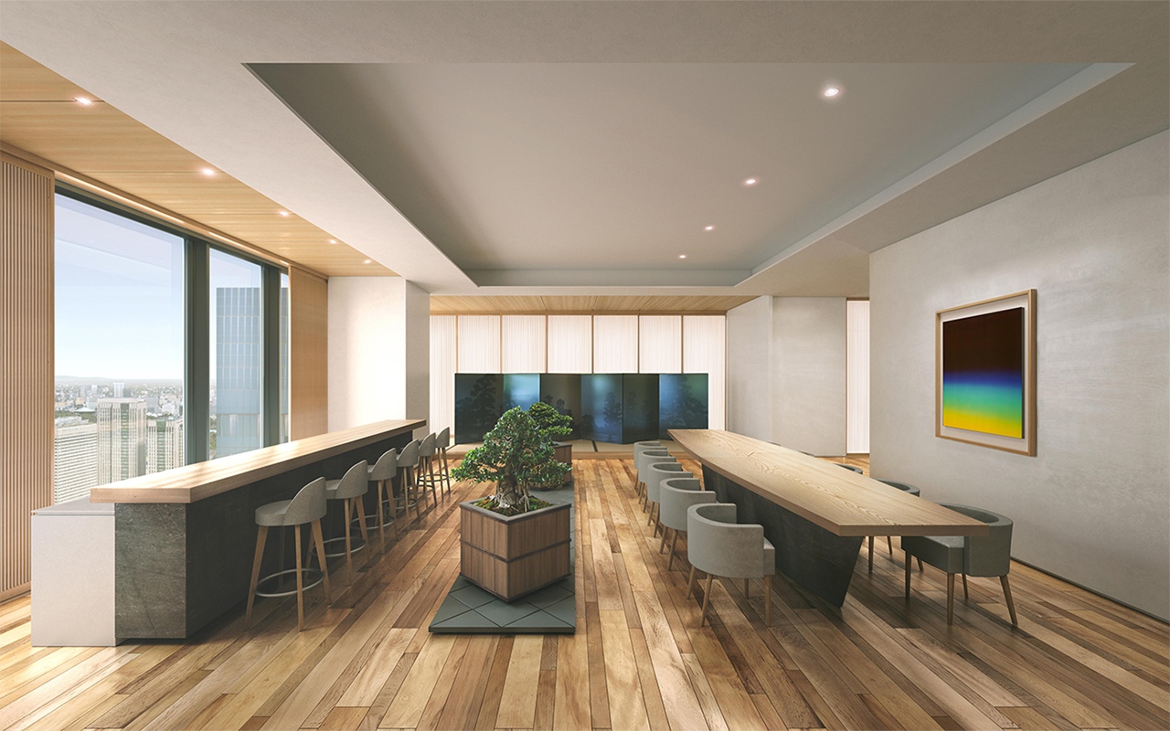
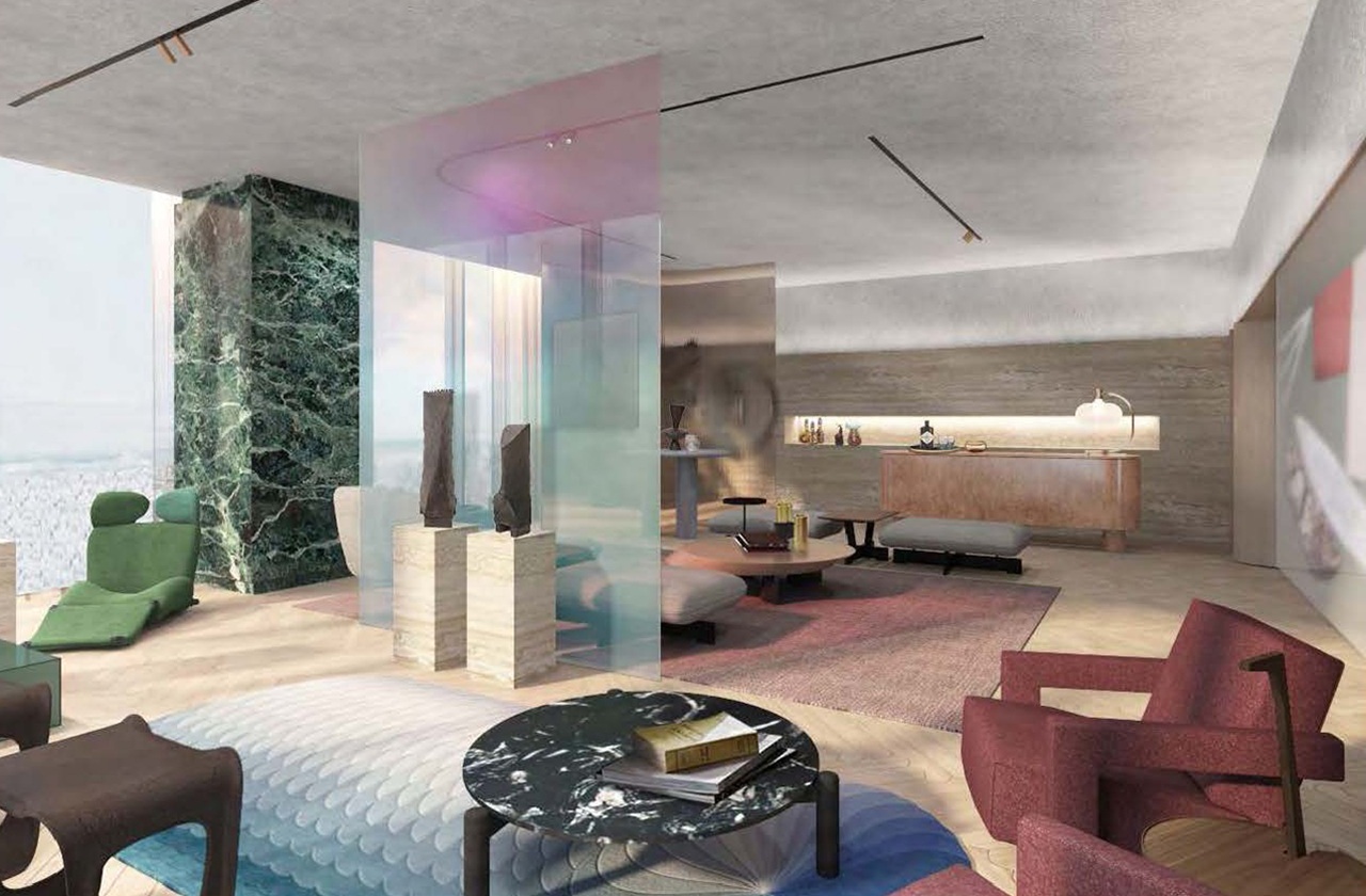
What would happen if Patricia Urquiola, an architect and designer based in Italy, were to design the same room as the plan by SHINSOKEN? The result was a proposal with a completely different feel. The expected target customer is a very wealthy couple who are successful business owners and enjoys collecting art. Since the house is for two people who travel around the world, the plan is a one-bedroom, but with a large art gallery.

A floor plan by Patricia Urquiola
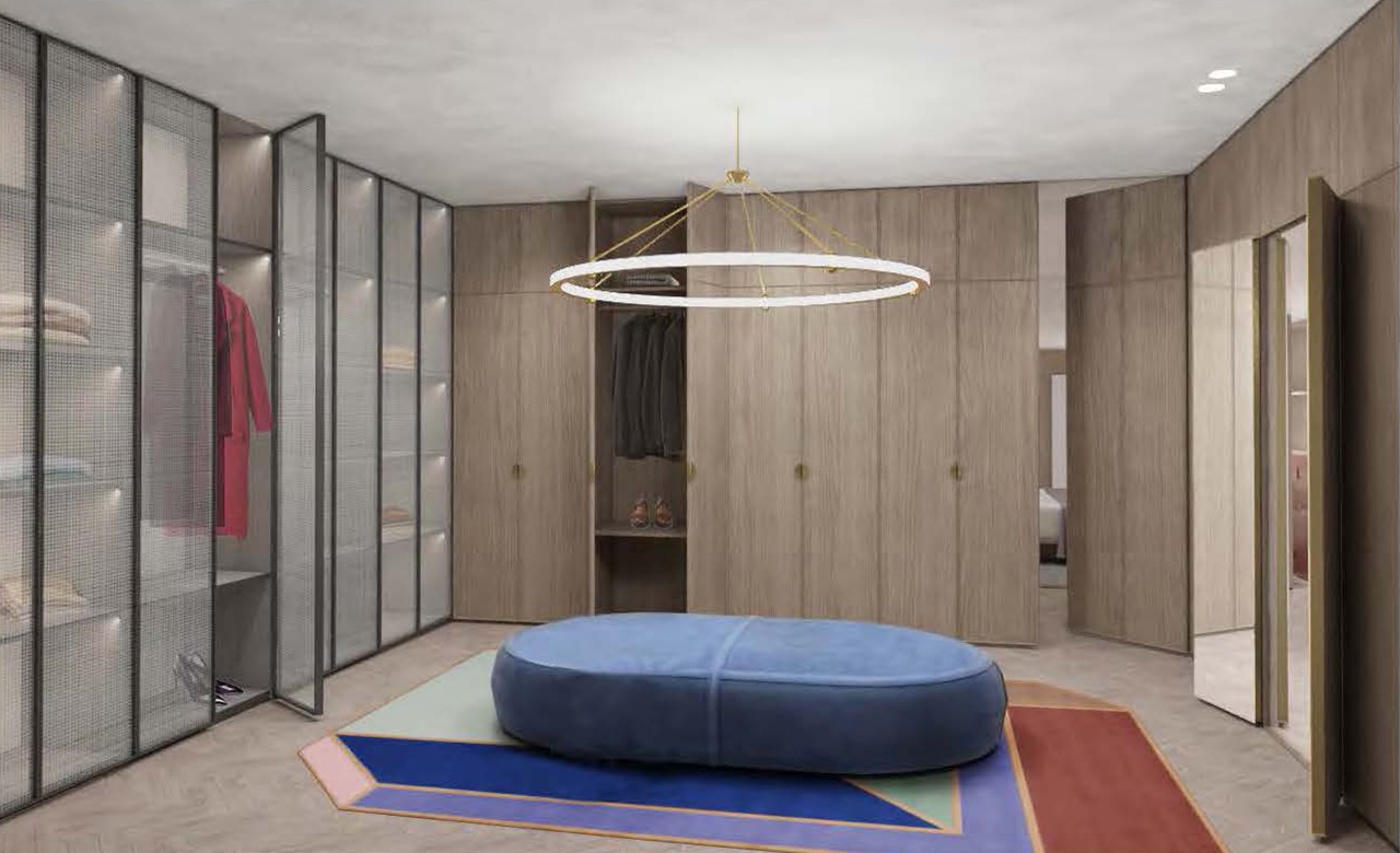
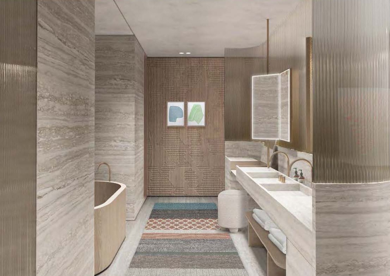
It shows Urquiola’s characteristic features – each space seems to be separated from the others, but they are not. The use of ribbed glass that seems to be transparent but does not allow a clear view, the curving of some of the walls, and the creation of spaces that seem to be loosely connected from room to room. The use of materials such as oak, marble, and stucco are also authentic, and the combination of these materials enhances the texture of each. Clearly, the furniture designed by Urquiola is also a major factor in the appeal of this plan.
It is certainly because Urquiola has been involved in numerous luxury facilities and interior design of hotels, as well as many product designs, that enable her to offer comprehensive, tailor-made housing solutions tailormade for each client’s lifestyle.

PATRICIA URQUIOLA
Born in Spain in 1961, she works and lives in Milan. Among here recent and more representative projects are Ca’ di Dio hotel in Venice, Four Seasons hotel in Milan, Cassina showroom in Milan, Il Sereno Hotel on Lake Como, just to name a few. She has also created a number of product designs for countless brands, such as Haworth, Flos, Louis Vuitton, Kartell, cc-tapis, Moroso, GAN. She is Cassina Art director since 2015. Her works have been exhibited in many international museums, including The Museum of Modern Art (MoMA) in New York, the Vitra Design Museum, and Victoria and Albert Museum.
❸ New challenges reflecting customer needs
We spoke with Teiichi Kobayashi, the section chief of Mori Building Residential Department Living Solution Group, about this initiative—Mori Building’s first foray into selling residential units in skeleton condition.
“We’ve had requests from customers who are in the process of purchasing to consider design changes, and some have said they would like to free-design their spaces and arrange the floor plans and interiors as they like. We’ve had clients who have purchased new Mori Building residences and then redone the layout plans and interiors from scratch. With that experience in the background, Mori Building decided to take on the challenge of selling a limited number of units as skeleton units.”
——What specific requests do you receive regarding floor plans and facilities?
“Some customers want to create an authentic Japanese room. Some want a spacious walk-in closet. Recently, we’ve seen more and more customers wanting to include a sauna and a cold plunge or Hinoki bath. We try to meet customers’ requests as much as possible, but we also take service and maintenance into consideration and explain the potential disadvantages and risks. Mori Building doesn’t just deliver a completed property and then be done with it; we also provide sufficient management and customer service after the property is complete. From that point of view, we are always willing to work with our customers to come up with the best possible plans.”
——I hear that these kinds of properties are rare in Japan. How about overseas?
“Overseas, it’s the opposite. Interiors have simple furnishings or come in a skeleton state, for the most part. I’ve visited and heard reports of high-rise luxury properties in London, Paris, Milan, Hong Kong, New York, and Miami, and basically, they’re handed over with minimal interior elements. This is because in Europe and the United States, real-estate properties are often around 100 years old, which means that the structure and infill components (interior) are essentially separate entities. Residents have established lifestyles, and they tend to do as they please with the floor plan and interior design. Many Japanese customers seeking this class of property have already built a house and are considering their purchase as a second or third home. They’re very knowledgeable and discerning about overseas designers, so we study global interior design trends on a daily basis so that we can give our customers good, appealing proposals.”
——For this project, world-class architects and designers contributed plans.
“Before the COVID-19 pandemic, we used to invite international designers and architects who were visiting Japan to come to the Mori Building Urban Lab, a research facility that holds a large-scale model of Tokyo and models of Mori Building’s ongoing projects. Since that time, some designers and architects have shown an interest in the Toranomon Project and said that they would definitely be willing to provide plans for the project free of charge. Usually, foreign designers don’t provide immediate proposals just because we pay for them. We’re grateful for the interest that these top designers from overseas have shown, and we are also aware of the high expectations for the properties.”
——Finally, could you go into the unique appeal of the skeleton units?
“From a sustainability perspective, it’s not a good idea to purchase a luxury property with the interior already finished and then tear it down and redo it. Our skeleton units come from the opposite approach. On top of that, they have the appeal of a newly built condominium in the heart of the city, with at least 220 square meters of luxurious space, built from scratch to suit your lifestyle. The units also sit on the 43rd floor and up, offering stunning views of Tokyo Tower and Tokyo Bay. I doubt there’s ever been a residence in Japan that offers those kinds of views with such excellent service. We’re also proud to say that the quality of the common area, spa, and restaurant—designed by Tony Chi—goes beyond even what a five-star luxury hotel offers.”
TORANOMON HILLS RESIDENTIAL TOWER

Address
1-1-1 Atago, Minato-ku, Tokyo
Access
2 min. walk from Toranomon Hills Station (Tokyo Metro Hibiya Line)
6 min. walk from Kamiyacho Station (Tokyo Metro Hibiya Line)
6 min. walk from Toranomon Station (Tokyo Metro Ginza Line)
9 min. walk from Onarimon Station (Mita Line)
* For more information including property overview, please visit the website.
* Visit the website for more information, including a property overview.
* The above rendering is based on drawings at the planning stage, and the shape and color of the conceptualization may differ from the actual building. Details of the shape and equipment are not shown.
* The view in the rendering is a composite of photographs taken in February 2020 from a height equivalent to the 41st floor of the planned site and differs from the actual view. Views differ from floor to floor and unit to unit. Views may change in the future depending on changes in the surrounding environment.
* The furniture and furnishings in the private areas (rendering and photographs) are not included in the sales price.
* A White Box Construction Finish Unit (skeleton units) is a dwelling unit finished with the legal minimum standard to meet the housing requirements of the Building Standards Act for clients who wish to conduct full renovation work after delivery. When performing full renovation work, in addition to “design costs and interior work costs such as construction costs, material costs, equipment costs, etc., removal costs for the existing kitchenette, unit shower, etc. will be incurred. These costs are not included in the selling price. Additionally, it may not be possible due to structural reasons to construct the plan exactly as designed by the client. In order to carry out interior work, the procedures stipulated in the management agreement must be followed and the approval of the manager must be obtained.









SHARE